SORA UNION
Modernize an investment firm's website to enhance digital impact
Frontier Capital Management is a boutique investment management firm founded in 1980. Dedicated to asset management, they deliver exceptional results to global institution investors.

From zero to launch while navigating constraints such as
Ongoing client feedback
Unexpected requirements
Maintain alignment
Budget limitations
Frontier was a brand missing both differentiation and emotional connection
After reviewing the Brand Audit and Market Research conducted by the design team, it became clear that Frontier lacked a clear value proposition and a compelling brand narrative that effectively engages current clients and attracts new prospectors.
Strengthening Frontier’s competitiveness was my north star
I realized that I needed to define a design direction that connected better with the audience. This approach was gonna be focused on:
Reorganize content and visual hierarchy
By creating a logical structure we were going to improve users' navigation. This process involved analyzing the existing layout to enhance clarity and usability.
Work on different concept ideas
To reflect not only the brand's personality but also our recommendations towards a more engaging experience.
AI was used to explore layout, visual elements, and content.

The fallen ideas of the design process
These versions moved away from a rigid and static feel, but after a quick review session with the Design Director, we noticed that these options were too bold and contemporary.
V1 - Too bold, dramatic, and experimental
Design overshadowed content, felt risky for a conservative audience.
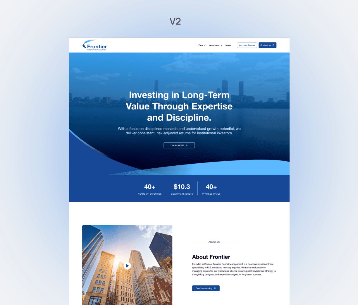
V2 - Too playful and tech-oriented
Not traditional enough.
V3 - Required some extra fine-tuning
But it leaned more toward the brand identity.
I started my exploration on Figma and used AI to explore layout, visual elements, and content.


I moved forward based on the strengths and weaknesses of the previous options
My vision started broadly and evolved into something more aligned with the brand's personality:
Conservative
Reliable
Trustworthy
To speed up the process, I moved into Framer, where I faced challenges re-creating the Investment Strategies' design across different breakpoints. I solved this by creating a variant that allowed the illustration scaled smoothly.

Client's feedback reflected many different perspectives, because decisions were made collaboratively
(which is a nice way of saying endless debates)
To tackle this, I synthesize and identified their different visions, while aligning everything with our research goals.
What did the client value?
Design approach
Simplicity
Creative ideas
modernity
Timeless
What needed change?
Concise homepage
Fewer blocks
Clear caption
Firm expertise
Suggested new ideas
Simple homepage
Reflect client's vision
Grounded in research
Key pages
My concerns
Hero section updates
Client requirements
Content structure
Remove CTAs
Key pages
We delivered a website that balanced client vision with research insights. I focused on communicating not only the firm’s history but also its investment philosophy, process, and strategy. Crucial information for both current and potential clients.


After 3 months from the re-launch of the product
Data suggested that the new design and strategy improved visibility and reach to a much broader audience, compared to the previous version.
255
>2K
N/A
~30%
4.3K
>10K
Endless thanks to the team behind this
Good results come to life through collective effort. We moved toward a shared goal with dedication in every step, turning challenges into opportunities and ideas into reality.