SmartList
Personal web-based shopping list application that allows you to create, manage, and track your items with automatic price calculation.
Role
Product Designer | Researcher
Date
2025 - 2026
Live Site
This was time comsuming
Watching a mom with her kid at the supermarket, she mentioned she forgot the milk again. After observing more shoppers, I noticed a pattern:
People were juggling different tools just to complete one trip. I was doing it too (Notes for the list and the calculator for total)
During Competitive Analysis, clear pattern emerged: Most solutions out there tried to cover too much
User reviews repeatedly highlighted frustration with complexity, intrusive ads, slow interfaces, and features that felt unnecessary for a simple shopping moment.
I wanted to avoid overbuilding and stay focused on the real problem. How I did it?
I used the MoSCoW method to intentionally prioritize only what directly supported essential features
Building this product meant stepping into unfamiliar territory: Removing Figma from my process and using AI as an execution accelerator
To stay in control of quality and product decisions, I used AI to quickly generate and iterate on components, logic, and interactions. Since I had little prior programming knowledge and was experimenting with vibe coding for the first time, I decided to:
Prompt a set of rules for AI-assisted development where brand standards, UI guidelines, and technical specifications were defined.
Create a QA prompt to review the generated code against these guidelines.
If you speak spanish, you can check my DOCO archive to learn how I usually work with the AI.
Initial concept exploration
The initial concept focused strictly on "must have" features, however the usability test revealed that
Some "Should Have" features were critical to task completion, while certain interactions created unnecessary friction during the shopping flow.
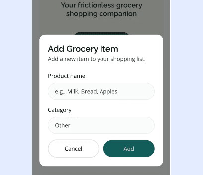
The solution focused on refining the flow by incorporating a key "Should Have" feature: Discount section. This adjustment was supported by design refinements to improve clarity and reduce friction.
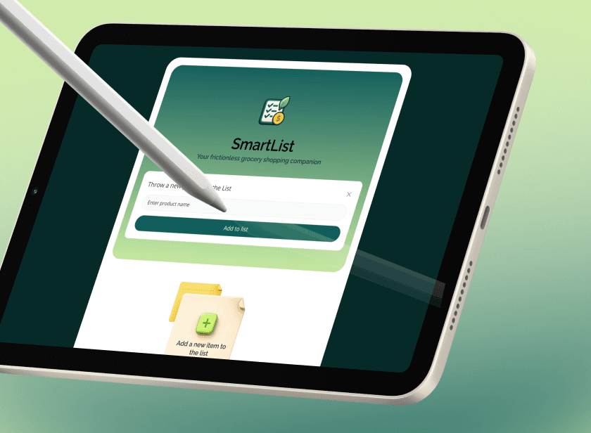
To avoid interrupting the flow, I simplified the experience by removing the pop-up interaction and allowing users to add items directly from the header.
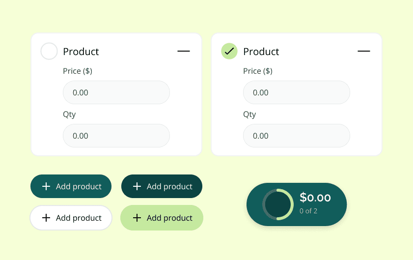
In the refined version, primary actions and totals were visually elevated, ensuring users could instantly identify the relevant information. I introduced stronger visual hierarchy to better support the interactions, as well as a more expressive, gradient-based container.
Final designs
The visual direction was inspired by calm productivity tools and modern fintech interfaces. The goal was to create an interface that feels trustworthy, lightweight, and reassuring, especially in a real-world context like grocery shopping, where speed and confidence matter more.
Impact and Outcome
The primary success metric focused on reducing the time to complete a grocery shopping trip.
Based on my own usage, consolidating listing, pricing, and totals reduced the time spent managing groceries from around 10 minutes to approximately 3-5 minutes per trip.


